Process mapping for SaaS operations teams
A guide for Heads of Operations, Chiefs of Staff, and RevOps leads at 50–200 person SaaS companies who are tired of maintaining the same workflow in three tools — and a comparison of where Lucidchart, Miro, Process Street, and Process Map actually fit.
If you run operations at a SaaS company between 50 and 200 people, you already know the shape of this problem. Somebody on the team made a Lucidchart of the customer onboarding flow eighteen months ago. Most of it is still right; some of it is wrong in ways that only the person who drew it would notice. There is a Notion page that tries to be the authoritative SOP, but the last meaningful edit was four months and one reorg ago. There is a Slack canvas your CSM lead pinned in the #onboarding channel because the Notion page was already too out of date to fix mid-call. None of the three references each other. None of them know who currently owns the "verify billing tier" step. None of them can answer the question your security team will ask in the next SOC 2 readiness check: "show us every process that touches customer PII, and who is accountable for each step."
That triple-stack — diagram tool, doc tool, chat-canvas tool — is not a tooling failure of any one of those three products. It is what happens when you try to do "process mapping" with tools that were built for adjacent jobs. Lucid is a diagram editor. Notion is a doc editor. Slack canvas is a notepad attached to a channel. None of them have a first-class concept of a role, an owning team, an upstream artifact, a downstream policy, or whether the workflow you are looking at is currently the source of truth or a stale draft. So you compensate by keeping all three open in tabs and trusting your memory.
This page is a long-form argument for why the right tool at the 50–200-person stage is a layered process map — a single canvas where the diagram, the role layer, the application layer, the artifact layer, and the policy layer all live together — and why generic diagramming and checklist apps stop scaling at exactly the size where ops becomes a function rather than a person. It also includes a head-to-head comparison of Process Map against the three tools you are most likely to be replacing: Lucidchart, Miro, and Process Street.
Why generic diagram tools fail for SaaS ops
Lucidchart and Miro are excellent at one thing: putting boxes and arrows on a canvas with multiple people editing at once. For brainstorming a flow, sketching an architecture, or running a workshop, they are the right tools. The trouble starts when the diagram needs to graduate from "an artifact someone made once" into "the operational source of truth for how this team works."
Pricing escalates the moment you need real permissions
The second-most-common complaint is pricing. Lucidchart's Team plan starts at $9 per user per month for individuals and roughly $30 per month for a team of three; Visio runs around $5 per month for the web version and $15 per month for the desktop one; Miro Starter is $8 per user per month. Those headline numbers look reasonable. The complaint is what happens when you need genuine multi-team permissions, audit trails, or shared template libraries — features that are routinely gated to the enterprise tier behind a sales call. For a 100-person company that wants to give the engineering team edit access on engineering processes and the CS team read-only on those same processes, "buy enterprise" is a $20k+ conversation for capabilities that should be table stakes.
Performance lag at scale
Reviewers of both Lucid and Miro repeatedly cite slowdowns on large diagrams or with many concurrent editors. For a fifty-shape sketch this is fine. For an actual operational map of a SaaS company — where you might end up with hundreds of process and task nodes across a dozen interconnected workflows — it stops being fine. The tool starts protecting itself with smaller canvases, more files, and more "this diagram is in another file" links, which is exactly the drift problem you were trying to solve in the first place.
Notion is not a diagramming tool, and that is fine
Notion gets used for process docs by default because it is already installed everywhere. The honest assessment is that it is good at narrative SOPs (long-form "here is how to do thing X") and bad at structured process modelling. There is no diagramming primitive — the embeds are screenshots from another tool. There is no role layer, no artifact lineage, no concept of "this step depends on that policy." Two teams document the same workflow on two pages and nothing reconciles them. By month six you have a "process docs" database with eighty entries and no idea which are still true. That is not a Notion bug; it is what happens when you use a doc tool for what should be a structured data problem.
Slack canvas is a notepad, not a system of record
Slack canvas exists because the other two failed at the moment of need. Someone needed to capture the actual current steps mid-call, in the channel where the work happens, and could not face editing the Notion page. The canvas wins on speed and dies on durability. Six months later, nobody remembers it exists; a year later, the channel has been archived. It is a symptom, not a tool choice.
The pattern
Each of these tools is doing a real job. The reason they fail in combination is that none of them treats process mapping as a first-class structured-data problem. They all treat it as a side-effect of doing something else — drawing, documenting, chatting. That is workable at five people. It cracks at fifty. It is actively expensive at two hundred.
See what a layered process map actually looks like in 60 seconds — sample data included.
Try Process Map freeWhat "process mapping" means for a 50–200-person SaaS
At ten people, process mapping means "Tom knows how it works, ask Tom." At a thousand people, you have a dedicated business operations function with a process architect on staff. The 50–200 band is the awkward middle where the work is real but the dedicated headcount usually is not. One person — Head of Ops, Chief of Staff, RevOps lead — owns "how the company runs," and they own it in addition to four other things.
At that stage, useful process mapping needs to do five concrete jobs:
- Survive a leadership change. When the person who made the diagrams leaves, the diagrams need to remain operationally useful to whoever inherits them. That means ownership is data, not tribal knowledge.
- Pass an audit without a side spreadsheet. The questions auditors and security reviewers ask — "who owns each step", "which processes touch this system", "where is the policy that governs this control" — should be answerable from the map itself. Not from a separate compliance tracker.
- Onboard a new hire to "the way we do things" in an hour, not a week. The map should be the canonical reference. New hires should not need to triangulate between a diagram, a Notion page, and three Slack threads.
- Show cross-process structure, not just individual workflows. The interesting questions at 100 people are not "what does the renewal process look like?" — anyone can sketch that. They are "which processes does the CS team own?", "which workflows depend on Salesforce?", "what does our security team own end to end?". Those are queries across processes, not zooms into one.
- Tell you what is rotting before someone finds out the hard way. Process documentation degrades the moment it is finished. The map should know what has not been touched in six months, what is missing an owner, and what was marked draft and never promoted. Ideally you do not have to ask.
Notice that none of those jobs is "draw a prettier diagram." The diagram is the entry point. The value is in everything attached to it — the role who owns each step, the application each task runs in, the artifact each step produces or consumes, the policy each step is governed by, and the freshness signal that tells you whether to trust what you are reading. A tool that nails the diagram and skips the rest is doing 20% of the job.
This is also why "just use Notion" or "just use Lucid" answers stop scaling at this size. Both are the right tool for one slice of the job and structurally incapable of the rest. A 50-person company can paper over the gap with effort. A 200-person company cannot.
Process Map's approach: layered, role-aware, governed
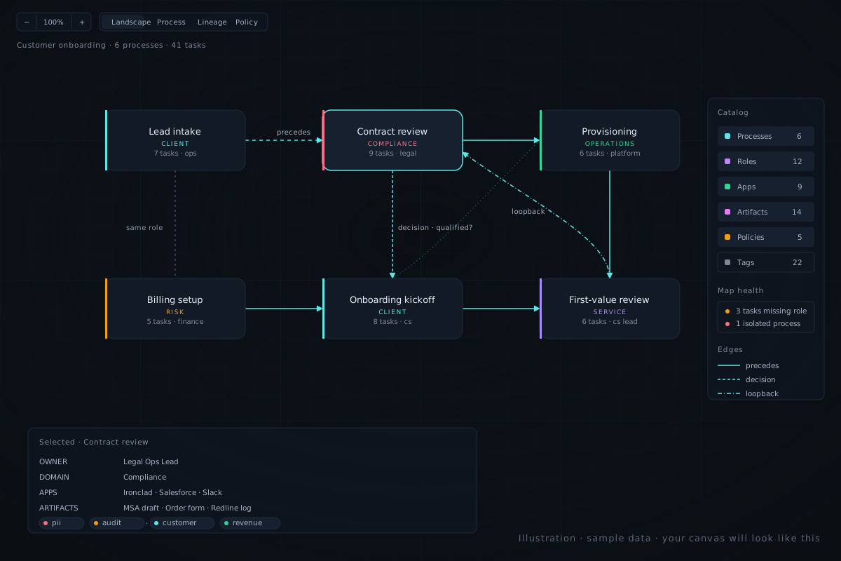
Process Map is built on a single architectural decision: the canvas is one of several views into a structured model, not the model itself. Every process you draw is also a row. Every task is a row. Every role, application, artifact, and policy is a first-class entity that can be queried, linked, and reasoned about across the whole map. Five things follow from that.
1. Layered, not flat
The canvas has six toggleable layers: the workflow itself, plus roles, applications, artifacts, policies, and the people who hold those roles. They are not annotations on a shape — they are real entities with their own pages, their own attributes, and their own relationships. Toggle on the Roles layer and you can see which processes share a role across the org. Toggle on the Applications layer and you can see which tools every team depends on. Toggle on the Policies layer and you can see which workflows are governed by which policy. The diagram does not change; the lens does.
This is the single biggest difference from Lucid or Miro. In a diagram tool, "this step is owned by the Billing team" is text inside a shape — useful to a human reading the diagram, invisible to the tool. In Process Map it is a relationship. You can ask the reverse question — "which steps does the Billing team own across every process?" — and the canvas can answer it.
2. Inline validation as you build
The side panel flags tasks missing a role, isolated nodes, processes that have no policy attached, and similar gaps — surfaced inline as you work, not via a quarterly audit ritual. The hints come from the data you already entered, so the first time you ask "what looks incomplete?" the answer is already on the screen.
This is a partial answer to one of the loudest complaints about checklist tools and BPMN suites: limited analytics, shallow reporting. The validation hints are not a separate analytics product — they are a side effect of having the data structured in the first place. A dedicated Map Health dashboard rolls every gap up across processes, so "what looks incomplete?" is one click away from the canvas.
3. Roles and RBAC are the same model
The roles you assign to processes and tasks are also the roles that gate who can edit what. There is no separate permissions system to keep in sync with the org chart. Define a custom role ("Renewals Lead", "Implementation Manager"), assign it to the tasks it owns, grant it edit access to the processes it owns, and that is the whole story. One source of truth for "who owns this" and "who can change this."
4. No BPMN nag
The modeller is built for people who do operations, not for people who passed BPMN certification. Process cards are rounded rectangles with plain-English labels. Edges clip to the shape perimeter so they do not look like they were drawn by a tired intern. Subtypes (decision, trigger, loopback) are encoded by dash pattern, not by a menu of seventeen BPMN element types. New stakeholders understand the canvas in a meeting, not a training course. This matters because the audience for a process map at a 100-person SaaS is not a process architect — it is a new hire, an auditor, or a cross-functional colleague.
5. Self-serve from the first click
Sign up with email, get a free workspace, click "Load sample data", and within a minute you are looking at a real organisation with multiple processes, dozens of tasks, populated role and policy layers, and inline validation hints already pointing at the gaps. You can decide whether the model fits your problem before talking to anybody. There is a public demo route for stakeholder previews (sample data, no login required). If the product does not click in that first session, the only thing you have spent is the click.
Process Map vs Lucidchart vs Miro vs Process Street
The honest comparison: Lucidchart and Miro are diagramming tools doing the diagram half of the job. Process Street is a checklist tool doing the runtime half. Process Map is built for the gap between them.
| Capability | Process Map | Lucidchart | Miro | Process Street |
|---|---|---|---|---|
| Visual process modelling | Yes — canvas with clipped edges and layered views | Yes — general-purpose diagrams | Yes — freeform whiteboard | Limited — checklist-first, weak diagramming |
| Roles as first-class entity | Yes — custom roles, assigned to tasks and processes | No — shape labels only | No — sticker notes only | Per-task assignees, not a role layer |
| Applications layer | Yes — toggleable cross-process view | No | No | No |
| Artifacts and policies as entities | Yes — each is queryable and linkable | No | No | No |
| Inline validation hints (missing role, isolated node, etc.) | Yes — surfaced in the side panel as you build | No | No | Limited — analytics on runs, not map structure |
| RBAC tied to the role model | Yes — roles are the permissions model | Not applicable — diagram tool, no role model | Not applicable — diagram tool, no role model | Per-template permissions, not org-wide roles |
| Starter price per user / month | $12 | $9 individual; team plans escalate | $8 Starter; many features in higher tiers | $30 Pro, multi-seat minimum |
| Common review complaint | — | "Enterprise gates basic features" | "Lag on large boards; gated add-ons" | "Pricey for a checklist tool; templates lacking" |
A reasonable summary: if the only job is drawing a diagram and sharing it, Lucid and Miro are fine — and you will outgrow them around the time the org passes 50 people, when "draw" stops being the binding constraint and "keep this honest" starts. If the only job is running a checklist on a recurring task, Process Street is fine — and you will keep needing a separate place to draw the picture. If the job is a layered, queryable, governed picture of how the company actually runs, that is what Process Map is for.
How to try it
The fastest way to evaluate any process tool is on your own data. The second fastest is on a real-shaped sample. Process Map ships with a sample-data button so you do not have to model your whole operation just to see the layered view do its thing.
Practically:
- Sign up — email is enough; no credit card.
- Click "Load sample data" on a fresh workspace.
- Toggle the Roles layer and the Applications layer on. Notice how the picture changes meaning.
- Open the side panel on any task and the validation hints appear inline.
- Then model one of your own processes. Aim for under ten minutes from "fresh canvas" to "first useful map."
If that first session does not click, you have lost a click. If it does, the next thing to do is invite the two or three people who currently own the workflows you mapped — the owners, the stakeholders, the auditor — and let them poke at it. The conversation you have with them is the actual evaluation.