Lucidchart vs Process Map: which one for your team?
Written for the buyer who is genuinely evaluating both — usually a Head of Operations, Chief of Staff, or RevOps lead at a 50–200 person SaaS company. Honest thesis up front: Lucidchart is excellent at general diagramming and workshops; Process Map is built for operational governance. They overlap on the canvas and diverge everywhere else. For some teams that means picking one. For most, it means using each for what it is good at.
One disclosure before we start: we built Process Map, so this is not a neutral review. We have tried to keep the Lucid sections grounded in recurring patterns from published G2, Capterra, and TrustRadius reviews rather than our wishlist of competitor weaknesses. If we get either side wrong, tell us and we will fix the page.
What each one is actually for
Lucidchart is a general-purpose diagramming tool. It does flowcharts, mind maps, org charts, network diagrams, ERDs, BPMN, UML, AWS architecture diagrams, and a long tail of other shapes. The core experience is a freeform canvas with multi-cursor real-time collaboration — you and three colleagues on the same diagram at once, building a picture together. That collaboration model and the breadth of templates are the two things reviewers consistently praise. If your job description includes the phrase "I draw a lot of different kinds of diagrams," Lucidchart is plausibly the right tool.
Process Map is not a general-purpose diagramming tool. It does one thing — operational process mapping — and treats the diagram as the front door to a structured, multi-layer model of how a company runs. Every process is also a row. Every task is a row. Every role, application, artifact, and policy is a first-class entity that can be queried, linked, and reasoned about across the whole map. Per-process visibility (org / restricted / private) and role-based access control are baked in rather than bolted on. The target user is the one Head of Operations, Chief of Staff, or RevOps lead at a 50–200 person SaaS who is trying to keep eight workflows honest in addition to four other jobs.
So these are not direct substitutes. They overlap on the canvas — both let you draw boxes and arrows in a browser — but their centers of gravity are in different places. Lucid is built outward from "general diagramming." Process Map is built outward from "this map needs to be operationally true six months from now."
Where Lucidchart wins
Lucid has been in this market for over a decade and has sanded down a lot of edges. There are five things it does that Process Map does not, and that you should weigh honestly before switching.
General-purpose diagramming. If your week includes an ERD on Monday, an AWS architecture diagram on Tuesday, an org chart on Wednesday, and a customer onboarding flow on Thursday, Lucid can do all four with the same shape library and shortcuts. Process Map only does the Thursday job. For teams whose diagramming needs are genuinely varied, that breadth is real value, not a hypothetical one.
Real-time multi-cursor collaboration. Reviewers consistently flag this as a Lucid strength: several people on the same canvas, watching each other's cursors, building a picture together. The closest thing the diagramming category has to Google Docs. Process Map does not have multi-cursor presence today. If your team's mode of working is "everyone in the room, on the canvas, at once," Lucid is the better fit.
Brainstorming and workshop modes. Lucid and its sibling Lucidspark lean into the workshop use case — sticky notes, voting, timers, freeform whiteboard surfaces. Process Map's canvas is structured rather than freeform — every node has a type — which makes it a poor fit for unstructured brainstorming.
Template library. Lucid ships with hundreds of templates across diagram types — SWOT, Kanban, SIPOC, customer journeys, the lot. Process Map ships with a sample-data button that loads a single demonstration organisation. Vertical templates (HR onboarding, vendor onboarding, monthly close, incident response) are on our near-term roadmap, but as of today Lucid's library is dramatically larger.
Integrations. Lucid has a long list of integrations — Confluence, Jira, Salesforce, Microsoft 365, Google Workspace, Slack. Embedding a Lucidchart in a Confluence page is well-trodden ground. Process Map's integration story today is narrow. If your evaluation requires "must embed in Confluence," Lucid wins that line item.
If your real job is general diagramming plus the occasional workshop, and "operational governance of how the company runs" is not on your plate, use Lucid and skip the rest of this page.
Where Lucidchart hurts at 50–200 people
The complaints below are not ours. They are the patterns that recur across published G2, Capterra, and TrustRadius reviews of Lucidchart, ranked by how often they appear. We are flagging them because they are the things that, in our experience talking to SaaS ops leaders, push teams to start looking for an alternative around the 50–200 person mark.
Pricing escalates the moment you need real permissions
Lucidchart's published pricing starts at around $9 per user per month for an individual plan and roughly $30 per month for a team of three. Those headline numbers are reasonable. The recurring complaint in reviews is what happens when you outgrow them: features that feel like table stakes for a growing company — multi-team permissions, audit visibility, more granular sharing controls — are routinely gated to higher tiers with sales-led pricing. The summary verbatim from one review cluster: "Enterprise gates basic features." For a 100-person company that simply wants the engineering team to have edit access on engineering processes and the CS team to have read-only on those same processes, that becomes a budget conversation rather than a settings change.
Performance lag at scale
Reviewers of both Lucid and Miro flag the same thing: the experience starts to slow down on large diagrams or with many concurrent editors. For a 50-shape sketch this never bites. For an actual operational map of a 100-person SaaS company — where you might end up with hundreds of process and task nodes across a dozen interconnected workflows — it does. The standard workaround is to break the work into smaller files linked together. That works, until it becomes the drift problem you were trying to solve in the first place: now there are six diagrams instead of one, and the relationships between them live in your head.
The diagram is "done" — and then what?
The deepest recurring complaint is structural rather than pricing or performance. Reviewers describe Lucid as a tool where the diagram ends where the work begins: no native concept of who owns a step, what tool that step runs in, or which policy applies. BPM-category reviewers specifically flag the absence of a bridge between the diagram and an executable SOP or runnable checklist. The picture and the operation drift apart within a quarter. You can write "Owner: Billing Team" inside a shape, but it is text — not a relationship. The tool cannot answer "show me everything the Billing Team owns across all our processes," because to the tool that string is indistinguishable from the shape's label.
No role, application, artifact, or policy layer
Same complaint, different angle. A process map for an operating company is layered: the workflow, the roles who own each step, the applications each step runs in, the artifacts it produces or consumes, and the policies that govern it. None of those are first-class concepts in a general-purpose diagram tool. You can paint them in by hand with colour-coded shapes and decorator boxes, but the moment the org chart shifts or a tool gets replaced you have to repaint by hand across every diagram. Reviewers articulate this as "we keep needing another tool" — Notion for the SOP, a spreadsheet for ownership, a third doc for policy mapping.
No map-health concept
Process documentation rots from the moment it is finished. In a general-purpose diagram tool, finding out which diagrams are stale, which are missing an owner, or which steps were marked draft and never promoted is a manual audit ritual — usually quarterly, usually skipped. Reviewers of checklist-led tools flag the same gap: limited analytics, shallow reporting on the structure of the work itself. Lucid is not unique here; it is the category default. For a buyer whose job description includes "make sure our processes are actually current," it is one of the most important gaps.
Mobile is weak
A smaller but persistent complaint: Lucid's mobile experience is read-only-ish and not a first-class part of the product. For a once-a-quarter stakeholder, fine. For an ops lead who needs to fix something on a phone, friction. We will note that Process Map's mobile experience is also view-only-grade today, so this is a Lucid-pattern observation rather than an advantage claim.
Want to see what the layered model actually looks like? Sample data loads in one click.
Try Process Map freeWhere Process Map fits
Process Map is built around one architectural decision: the canvas is one of several views into a structured model, not the model itself. Every box on the screen is also a row in a database, with typed relationships to other rows. That decision shapes everything that follows. The five things below are what is actually in the product today; anything that is on the roadmap we have flagged.
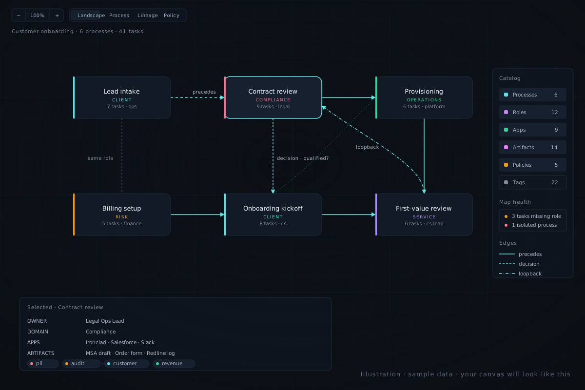
Multi-layer canvas. Six toggleable layers: the workflow itself, plus roles, applications, artifacts, policies, and the people who hold those roles. They are not annotations on a shape — they are real entities with their own detail pages, attributes, and relationships. Toggle Roles and the canvas overlays which steps each role owns; toggle Applications and the same canvas shows tool dependencies; toggle Policies and it shows which workflows are governed by which policy. The diagram does not change; the lens does. This is the single biggest difference from a general-purpose diagram tool, and the easiest way to see it is to load sample data and toggle layers.
Role-based RBAC that uses the same role model. The custom roles you assign to processes and tasks are also the roles that gate who can edit what. Define "Renewals Lead", assign it to the tasks it owns, grant it edit access on the processes it owns. One source of truth for "who owns this" and "who can change this" — no separate permissions system to keep in sync with the role layer. Meaningful contrast with Lucid's generic permissions, which by design do not know what a role is in the org sense.
Per-process visibility and sharing. Each process has a visibility setting — org / restricted / private — plus an additive grants list of specific people or roles who get view or edit access. A sensitive HR offboarding flow can be scoped to "HR + Legal only" without making the whole workspace private. This shipped recently and is in production today. It directly addresses the pricing complaint about Lucid: real per-process permissions without a sales call.
Inline validation hints. The side panel surfaces structural gaps as you build — tasks missing a role, isolated nodes, processes without a policy attached. Because the data is structured, the hints are a side-effect of the model rather than a separate analytics product. A dedicated Map Health dashboard (stale processes, uncovered roles, policies missing an owner, all in one view) is on the near-term roadmap and is not yet shipped — today the validation lives in the side panel where you edit.
Self-serve, no credit card, sample data in one click. Sign up with email, get a workspace, click "Load sample data," and within a minute you are looking at a real organisation with multiple processes, populated role and policy layers, and validation hints already pointing at the gaps. There is also a public demo route at /demo for stakeholder previews — no login required.
Things we are deliberately not claiming, to head off confusion: real-time multi-cursor presence is not built. SSO is not built. Audit log is in flight but not yet shipped. Public per-workspace share links (where a stakeholder views your private processes through a link without logging in) are not built — the global /demo route is the only public surface today. We would rather you find this list here than discover it inside a trial.
When to choose which
A reasonable decision tree:
Choose Lucidchart if your dominant use case is general-purpose diagramming across multiple kinds of diagrams (flowcharts plus ERDs plus org charts plus AWS), your team genuinely lives in real-time multi-cursor workshop sessions, you need a deep template library across diagram types, or you have a hard requirement for tight integration into Confluence, Salesforce, or another tool Lucid already plugs into. None of those are things Process Map is currently better at, and pretending otherwise would be dishonest.
Choose Process Map if your dominant use case is operational process documentation that has to stay honest beyond the meeting it was drawn in. Specifically: you want roles, applications, artifacts, and policies as first-class layers rather than colour-coded shapes; you want per-process access control without a sales call; you want inline validation as you build rather than a quarterly audit; you want a fast, modern canvas that does not lag; or you want to be self-serve from the first click. The 50–200 person SaaS ops profile is where this lands cleanest, but the same shape applies to RevOps teams, compliance leads at regulated SMBs, and internal consulting practices producing client deliverables.
Run both in parallel if you genuinely have both jobs — diagramming and ops governance — and they are big enough to warrant separate tools. You would not be the first team using Lucid for "draw-anything" and a structured ops tool for "keep this honest." Our expectation is that Process Map will absorb more of the structured-process-mapping use case over time, so the parallel setup may shrink to "Lucid for non-process diagrams only" — but that is a forecast, not a today claim.
Side-by-side comparison
A capability-by-capability summary. Same caveat as above — every Lucid claim here traces back to the recurring patterns in published reviews, not to our wishlist. Every Process Map claim describes what is in the product today.
| Capability | Lucidchart | Process Map | Winner |
|---|---|---|---|
| General-purpose diagramming (ERD, AWS, mind maps, etc.) | Broad — hundreds of shape types | Not the focus — process modelling only | Lucidchart |
| Real-time multi-cursor collaboration | Yes — long-standing strength | Not built today | Lucidchart |
| Brainstorming / workshop modes (sticky notes, voting) | Yes — Lucid + Lucidspark | No — canvas is structured, not freeform | Lucidchart |
| Template library (across diagram types) | Hundreds across categories | Sample-data button only; vertical templates on roadmap | Lucidchart |
| Roles as a first-class entity, not a shape label | No — text inside shapes | Yes — custom roles assigned to tasks and processes | Process Map |
| Applications, artifacts, policies as queryable layers | No | Yes — toggleable cross-process layers | Process Map |
| Per-process access control (org / restricted / private + grants) | Sharing exists; finer-grained controls cited as gated to higher tiers | Yes — built in, no upsell | Process Map |
| RBAC tied to the same role model used on the canvas | Not applicable — generic permissions, no role layer | Yes — roles are the permissions model | Process Map |
| Inline validation hints (missing role, isolated node, etc.) | No | Yes — surfaced in the side panel as you build | Process Map |
| Map-health dashboard (stale, uncovered, unowned) | No | Inline today; dashboard on roadmap | Tied (both pending) |
| Performance on large maps with many editors | Reviewers cite lag at scale | Modern React canvas; no lag complaints to date | Process Map |
| Starter price per user / month | $9 individual; team plans escalate | $12 (no card during beta) | Comparable |
| Common review complaint | "Enterprise gates basic features"; "lag on large diagrams" | Newer product; smaller integration surface | — |
The pattern, simplified: Lucid wins on breadth, collaboration mode, and template depth. Process Map wins on operational structure, access control, and the things that keep a process map honest after the meeting that produced it. Neither one is "better" in the abstract. They are pointed at different jobs.
How to actually evaluate
The best way to evaluate any process tool is on your own data. The second best is on a real-shaped sample. If you are considering Process Map alongside Lucid, the cheapest possible experiment is:
- Sign up — email is enough; no credit card.
- Click "Load sample data" on the fresh workspace.
- Toggle the Roles layer and the Applications layer on. The same canvas should now answer different questions.
- Open the side panel on any task; the validation hints appear inline.
- Open the visibility settings on any process and try the org / restricted / private modes. This is the per-process access control that Lucid reviewers most commonly want and most commonly cannot get without a sales call.
- Then model one of your own processes. Aim for under ten minutes from "fresh canvas" to "first useful map."
If the layered model does not earn its keep in that first session, stay on Lucid. If it does — and the test we would suggest is "could I delete two of my current tools and consolidate here?" — the next step is to invite the two or three people who actually own the workflows you mapped. The conversation you have with them is the real evaluation.